Examples For ggplot2
| Author: | Mitch Richling |
| Updated: | 2022-06-04 16:17:46 |
Copyright 2020-2021 Mitch Richling. All rights reserved.
Table of Contents
- 1. Metadata
- 2. Setup
- 3. Two Corrilated Variables
- 3.1. x-y scatter plot
- 3.2. Time Series scatter plot broken down by a factor (Fancy Axis)
- 3.3. x-y scatter plot broken down by a factor (Fancy Axis)
- 3.4. x-y scallter plot broken down by factor (fancy titles)
- 3.5. x-y scatter plot with facets instead of color.
- 3.6. x-y scatter plots with facets and trends (lowess & linear regression)
- 3.7. Simple x-y graphs with linear regression lines
- 3.8. linear regression used for future prediction
- 4. Distribution Comparison
- 5. 2D Data
- 5.1. Images
- 5.1.1. Simple Example
- 5.1.2. A dot in each cell scaled to
abs(z) - 5.1.3. White text in each cell
- 5.1.4. Text in each cell with a color set by the z value
- 5.1.5. Contours in white
- 5.1.6. Contours in white (via
stat_contourinstead ofgeom_tile) - 5.1.7. Just contour lines colored determined by contour level
- 5.2. Histograms
- 5.1. Images
- 6. Barcharts
- 7. 1D Histograms
- 8. Pallets
- 9. Miscellaneous Stuff
- 10. Area graphs
1. Metadata
The home for this HTML file is: https://richmit.github.io/ex-R/ggplot.html
Files related to this document may be found on github: https://github.com/richmit/ex-R
Directory contents:
src |
- | The org-mode file that generated this HTML document |
docs |
- | This html document |
data |
- | Data files |
tangled |
- | Tangled R code from this document |
2. Setup
2.1. Load libraries
ggplot2 is the graphics library, and gridExtra helps us lay things out.
library(ggplot2)
library(gridExtra)
library(reshape2)
library(scales)
2.2. Create some data sets we can graph
numPnt <- 1000
numCat <- 4
someData <- data.frame(xi=(1:numPnt)/numPnt,
                       xi2=(1:numPnt)/numPnt+2,
                       xd=seq(as.POSIXct('2012-01-01'), by='day', length.out=numPnt),
                       rn=runif(numPnt, -.6, .6),
                       m=rep(1:numCat,(numPnt/numCat)))
someData$rm <- someData$rn*someData$m
someData$y  <- someData$m*(someData$xi-0.5)+0.5+someData$rm
someData$y2 <- 2.5*(someData$xi-0.5)+0.5
someData$k1 <- paste('K1F', someData$m, sep='_')

someMoreData <- read.table(header=T, text='
 quarter factors   value emin emax
      Q1 factor1      15   14   16
      Q2 factor1      25   22   29
      Q3 factor1       5    1    6
      Q4 factor1      10    8   11
      Q1 factor2      25   22   23
      Q2 factor2      20   19   21
      Q3 factor2      25   20   26
      Q4 factor2      10   10   11
 ')

someLessData <- subset(someMoreData, someMoreData$factors=='factor1')
someLessData$factors <- factor(someLessData$factors)

twoDimData  <-expand.grid(x=seq(from=-4, to=4, length.out=30), y=seq(from=-3, to=5, length.out=30))
twoDimData$z<-sin(twoDimData$x*twoDimData$x+twoDimData$y*twoDimData$y)
twoDimData$p<-sign(twoDimData$z)

volcanoDF   <- stack(as.data.frame(volcano))
volcanoDF$x <- rep(seq_len(nrow(volcano)), ncol(volcano))
volcanoDF$y <- rep(seq_len(ncol(volcano)), rep(nrow(volcano), ncol(volcano)))

twoDimNormal <- data.frame(x=rnorm(10000, sd=2.0),
                           y=rnorm(10000))
twoDimNormal$y <- twoDimNormal$y+twoDimNormal$x*.75
3. Two Corrilated Variables
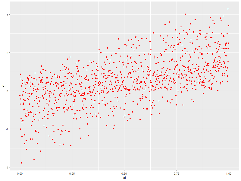
3.1. x-y scatter plot
ggplot(data=someData, aes(x=xi, y=y)) +
  geom_point(col='red') ## Make the points RED -- very diffrent: geom_point(aes(col='red'))
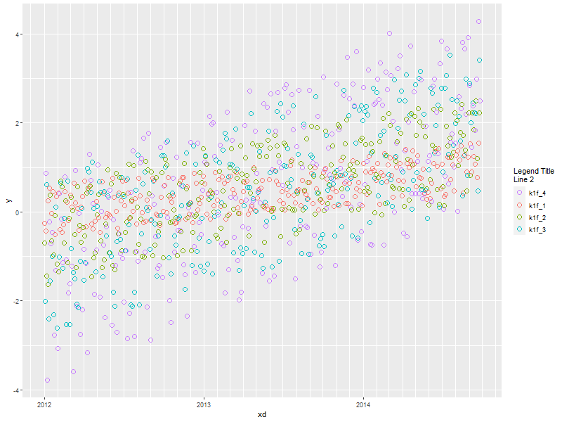
3.2. Time Series scatter plot broken down by a factor (Fancy Axis)
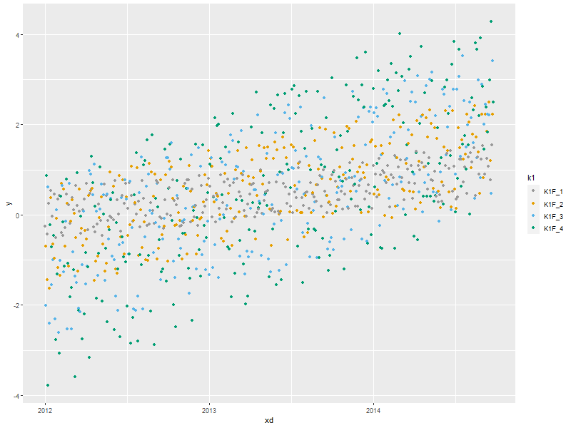
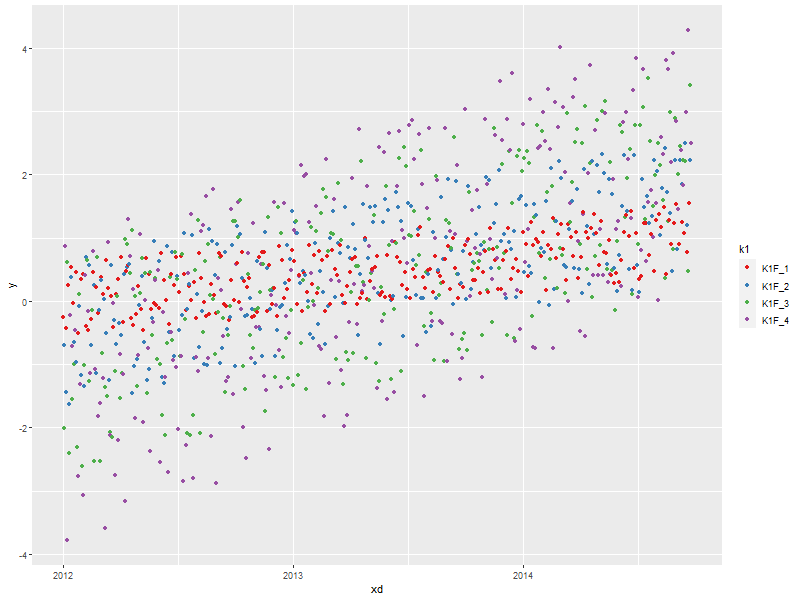
ggplot(data=someData, aes(x=xd, y=y, col=k1)) +
  scale_x_datetime(breaks       = scales::date_breaks("1 year"),  ## Set major break lines to 1 year
                   minor_breaks = scales::date_breaks("1 month"), ## Set minor break lines to 1 year
                   labels       = scales::date_format("%Y")) +    ## Set the date format
  geom_point(size=3, pch=21) +                                    ## BIG Circles for points
  scale_colour_discrete(name ="Legend Title\nLine 2",
                        breaks=c("K1F_4", "K1F_1", "K1F_2", "K1F_3"),
                        labels=c("k1f_4", "k1f_1", "k1f_2", "k1f_3"))
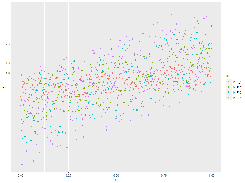
3.3. x-y scatter plot broken down by a factor (Fancy Axis)
ggplot(data=someData, aes(x=xi, y=y, col=k1)) + geom_point() +
  #theme(panel.grid.major=element_blank())          ## Zap major grid lines
  #theme(panel.grid.minor=element_blank())          ## Zap minor grid lines
  #theme(axis.ticks=element_blank())                ## x-axis: Zap ticks
  #theme(axis.text.x=element_blank())               ## x-axis: Zap Labels
  scale_y_continuous(breaks=c(1, 1.5, 2.5, 5, 6,8)) ## y-axis: Set location for ticks and grid lines
  #scale_y_continuous(breaks=NULL)                  ## Zap y tick and grid lines
  #scale_x_continuous(breaks=NULL)                  ## Zap x tick and grid lines
  #scale_x_continuous(limits=c(-1, 2))              ## Remove data outside the limits
  #xlim(NA, 2)                                      ## Like above.  Use NA to not set limit.
  #coord_cartesian(xlim = c(-1, 2))                 ## Simply set the visible region.
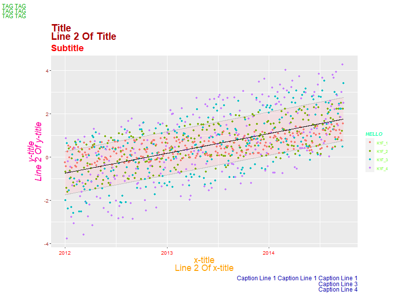
3.4. x-y scallter plot broken down by factor (fancy titles)
Adding a 'ribbon' of color to a plot (useful for things like confidence intervals and ranges around a smoother). Also demo some crazy title and legend stuff.
ggplot(data=someData, aes(x=xd)) +
  geom_ribbon(aes(ymin=y2-1, ymax=y2+1), alpha=.3, fill='pink', col='grey') +  ## alpha is important
  geom_point(aes(y=y, col=k1)) +                                               ## Colorful points
  geom_line(aes(y=y2), col='black') +                                          ## Center line
  labs(title    = "Title\nLine 2 Of Title",
       subtitle = "Subtitle",
       tag      = 'TAG TAG\nTAG TAG\nTAG TAG\n',
       x        = 'x-title\nLine 2 Of x-title',
       y        = 'y-title\nLine 2 Of y-title',
       caption  = "Caption Line 1 Caption Line 1 Caption Line 1\nCaption Line 3\nCaption Line 4") +
  theme(plot.title    = element_text(lineheight=0.7, face="bold",   colour="#aa0000", size=20, angle=0))  +
  theme(plot.subtitle = element_text(lineheight=0.7, face="bold",   colour="#fa0000", size=18, angle=0))  +
  theme(plot.caption  = element_text(lineheight=0.8, face="plain",  colour="#0000aa", size=12, angle=0))  +
  theme(plot.tag      = element_text(lineheight=0.7, face="plain",  colour="#00aa00", size=12, angle=0))  +
  theme(axis.title.x  = element_text(lineheight=0.7, face="plain",  colour="#ffa000", size=18, angle=0))  +
  theme(axis.title.y  = element_text(lineheight=0.7, face="italic", colour="#ff00a0", size=18, angle=90)) +
  theme(axis.text.x   = element_text(angle=0, color='red',   vjust=0.5, size=10))                         +
  theme(axis.text.y   = element_text(angle=0, color='brown', vjust=0.5, size=10))                         +
  #theme(legend.title=element_blank()) +  ## This is how you nix a legend title entirely
  guides(col=guide_legend(title="HELLO")) +
  theme(legend.title = element_text(colour="#00ffa0", size=10, face="bold.italic"),
        legend.text  = element_text(colour="#60ff00", size=8,  face="plain"),
        legend.position="right") ## Put the legend on the right side of the graph
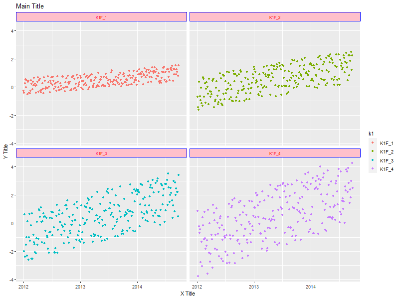
3.5. x-y scatter plot with facets instead of color.
ggplot(data=someData, aes(x=xd, y=y, col=k1)) +  ## col=k1 has nothing to do with facets
  geom_point() +
  facet_wrap(~k1, ncol=2) +   ## Gets facets in a grid
  #facet_grid(.~k1)  +        ## Gets facets arranged left to right
  #facet_grid(k1~.)  +        ## Gets facets arranged top to bottom
  labs(title = 'Main Title',
       x     = 'X Title',
       y     = 'Y Title') +
  theme(strip.text.x = element_text(size=8, face="plain", colour='red',  angle=0),  ## y-axis strip text
        strip.text.y = element_text(size=8, face="bold",  colour='blue', angle=90), ## y-axis strip text
        strip.background = element_rect(colour="blue", fill="pink"))                ## Strip border and fill
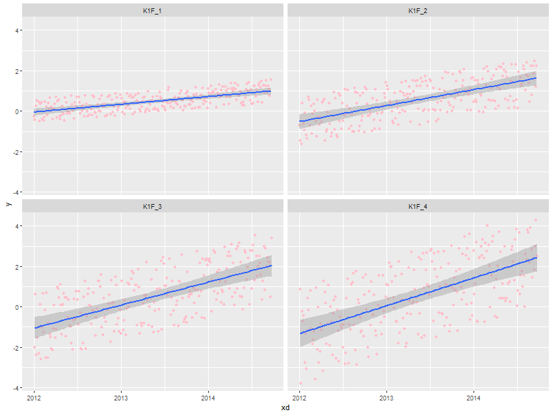
3.6. x-y scatter plots with facets and trends (lowess & linear regression)
ggplot(data=someData, aes(x=xd, y=y)) +
  geom_point(col='pink') +                             ## Draw the points in pink
  #geom_smooth(method="loess") +                       ## DEFAULT. lowess.  Show confidence interval.
  #geom_smooth(method="lm") +                          ## Linear model
  geom_smooth(method="lm", level=0.9999) +             ## Linear model with explicit confidence level
  #geom_smooth(method="lm", se=FALSE) +                ## Don't show the confidence interval
  #geom_smooth(method="gam", formula = y~s(x)) +       ## Generalised additive model.  Needs library(mgcv)
  #geom_smooth(method="rlm") +                         ## Robust linear regression. Needs library(MASS)
  facet_wrap(~k1, ncol=2)
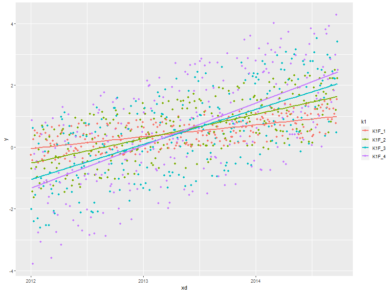
3.7. Simple x-y graphs with linear regression lines
ggplot(data=someData, aes(x=xd, y=y, col=k1)) +
  geom_point() +                                      ## Draw points
  geom_smooth(method="lm", se=FALSE)                  ## Don't show the confidence interval
  #geom_smooth(method="loess", span=.2, se=FALSE)     ## lowess.  No confidence interval
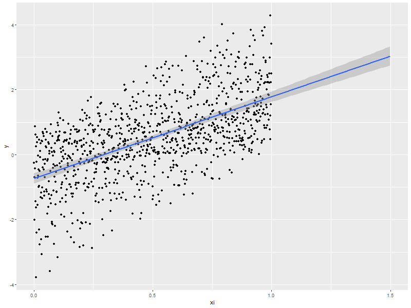
3.8. linear regression used for future prediction
expandedRange <- c(min(someData$xi),                     ## Range from min to max+1/2 the range.
                   max(someData$xi) +
                       diff(range(someData$xi))/2)
ggplot(data=someData, aes(x=xi, y=y)) +
  scale_x_continuous(limits = expandedRange) +         ## Extend the x-axis. coord_cartesian won't work here.
  #geom_line() +                                       ## Add this if you want to connect the dots. ;)
  geom_point() +                                       ## You can also use points!
  geom_smooth(method="lm", fullrange=TRUE, level=0.99) ## Linear model with a .99 confidence interval
4. Distribution Comparison
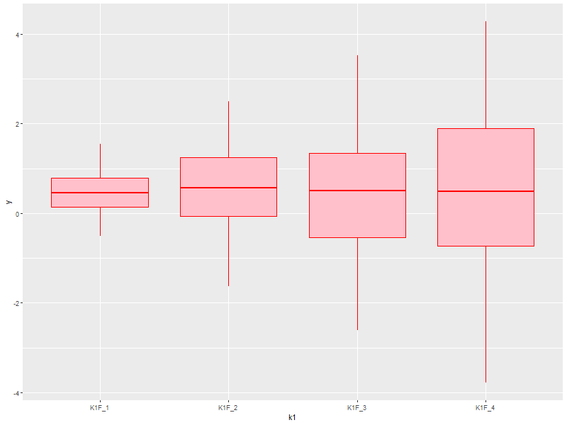
4.1. Box-n-Wisker
ggplot(data=someData, aes(x=k1, y=y)) +
  geom_boxplot(col='red', fill='pink')
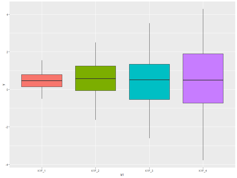
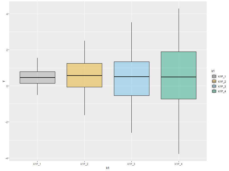
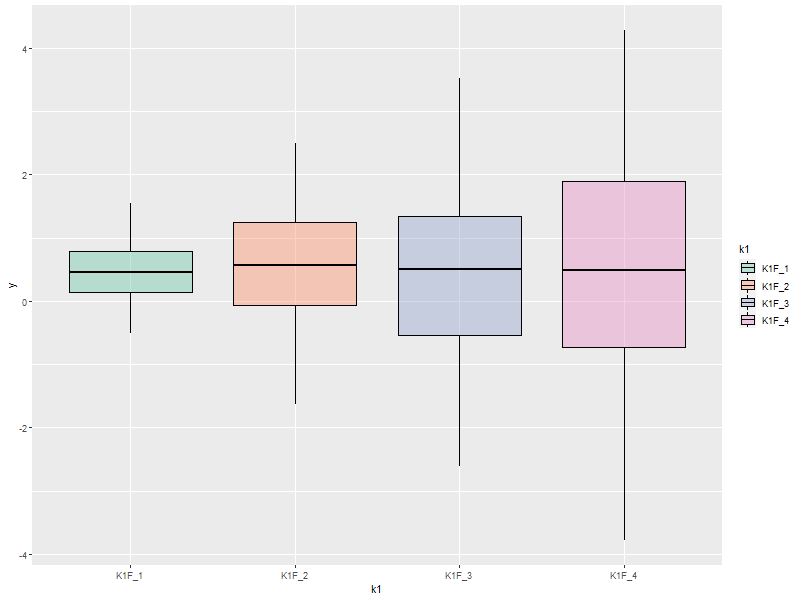
4.2. Colorful Box-n-Wisker
ggplot(data=someData, aes(x=k1, y=y, fill=k1))+
  geom_boxplot(show.legend=FALSE)                  ## Suppress the legend
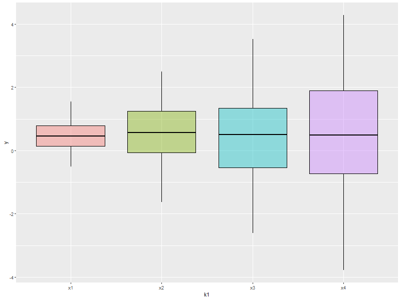
4.3. Category labels on the axis with no legend
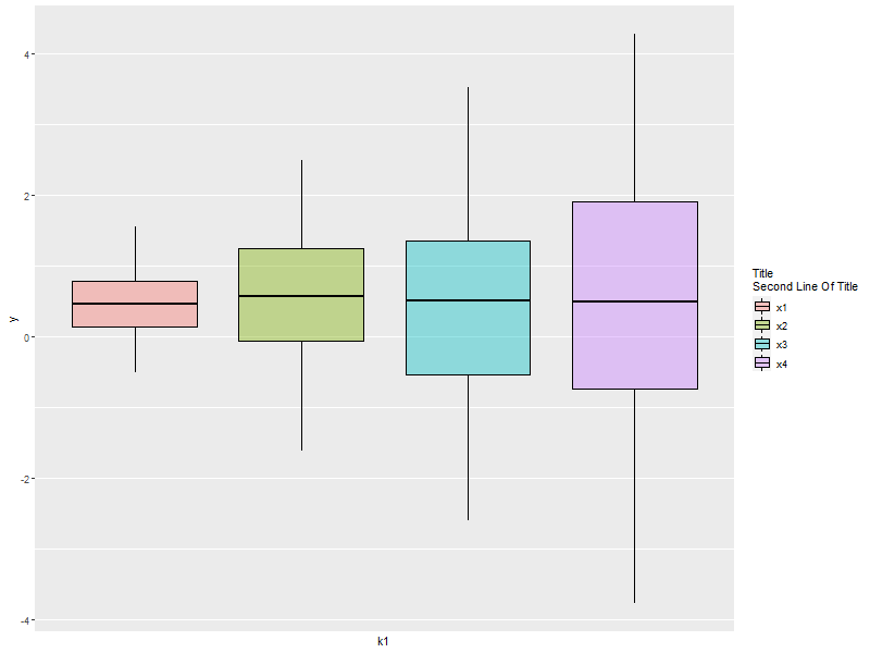
ggplot(data=someData, aes(x=k1, y=y, fill=k1)) +
  geom_boxplot(col='black', alpha=.4, show.legend=FALSE) +
  scale_x_discrete(labels=c("x1", "x2", "x3", "x4")) +
  scale_fill_discrete(name="Title\nSecond Line Of Title",  ## Set title of legend
                      labels=c("x1", "x2", "x3", "x4"))    ## Set labels of legend
4.4. Category labels on the axis with no legend
ggplot(data=someData, aes(x=k1, y=y, fill=k1)) +
  geom_boxplot(col='black', alpha=.4) +
  scale_x_discrete(breaks=NULL) +                          ## x-axis: Zap the lables all togehter
  scale_fill_discrete(name="Title\nSecond Line Of Title",  ## Set title of legend
                      labels=c("x1", "x2", "x3", "x4"))    ## Set labels of legend
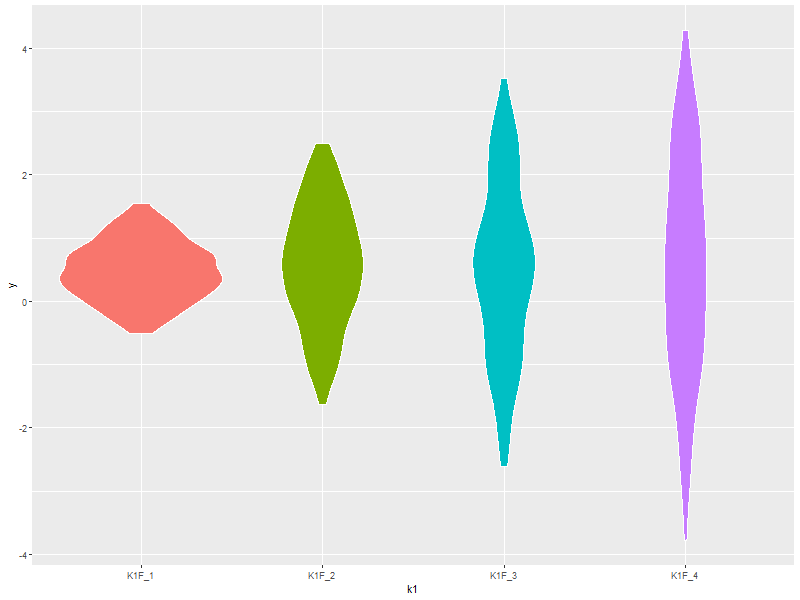
4.5. A standard violin plot
Note: The white borders help the regions stand out
ggplot(data=someData, aes(x=k1, y=y, fill=k1)) +
  geom_violin(col='white',             ## Add white border on the violins
              show.legend=FALSE)       ## Suppress the legend
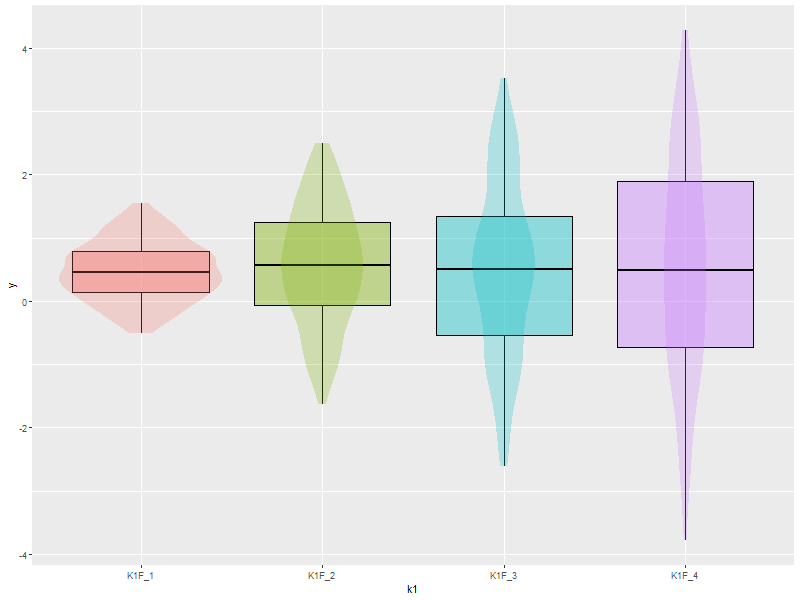
4.6. Combine a violin and box-n-wisker plot
ggplot(data=someData, aes(x=k1, y=y, fill=k1)) +
  geom_boxplot(col='black', alpha=.4) +
  geom_violin(alpha=.25, col=NA) +
  theme(legend.position="none")
5. 2D Data
5.1. Images
5.1.1. Simple Example
ggplot(data=twoDimData, aes(x=x, y=y, fill=z)) +
  geom_tile()
  #geom_raster() ## geom_raster() is faster, but requires length(x)==length(y)

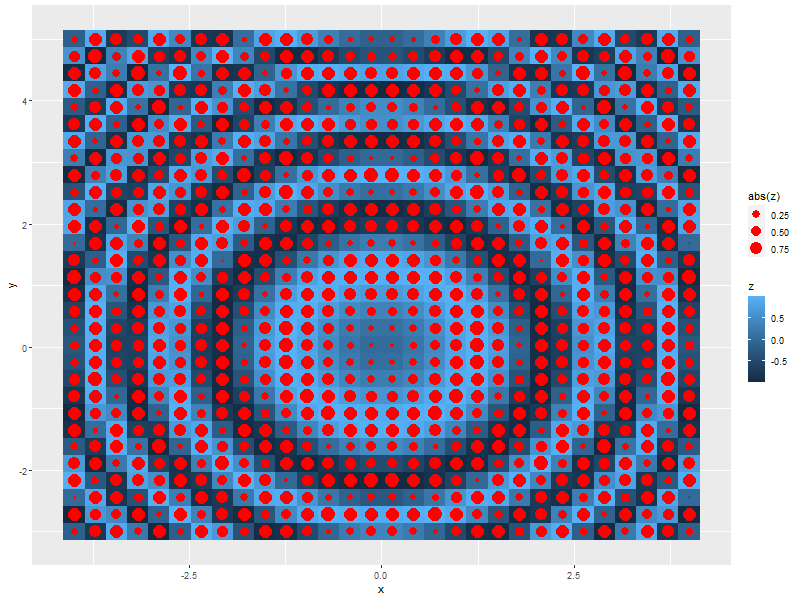
5.1.2. A dot in each cell scaled to abs(z)
ggplot(data=twoDimData, aes(x=x, y=y)) +
  geom_tile(aes(fill=z)) +
  geom_point(aes(size=abs(z)), col='red')
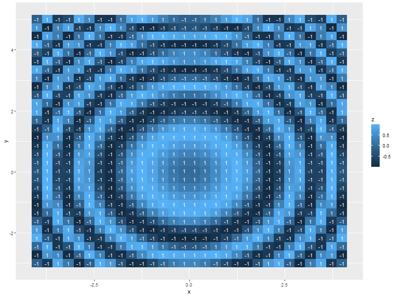
5.1.3. White text in each cell
ggplot(data=twoDimData, aes(x=x, y=y)) +
  geom_tile(aes(fill=z)) +
  geom_text(aes(label=p), col='white', size=4)
5.1.4. Text in each cell with a color set by the z value
ggplot(data=twoDimData, aes(x=x, y=y)) +
  geom_tile(aes(fill=z)) +
  geom_text(aes(label=p), col=c('red', 'black', 'green')[sign(twoDimData$z)+2], size=4)

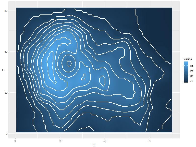
5.1.5. Contours in white
ggplot(data=volcanoDF, aes(x=x, y=y)) +
  geom_raster(aes(fill=values), interpolate=TRUE) +  # tile has no "interpolate" option.
  geom_contour(aes(z=values), col='white', size=1)
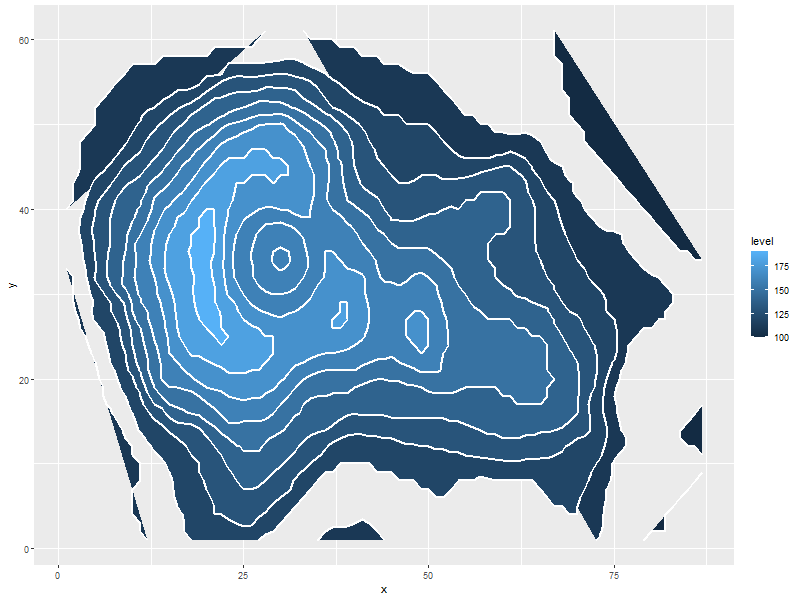
5.1.6. Contours in white (via stat_contour instead of geom_tile)
ggplot(data=volcanoDF, aes(x=x, y=y, z=values)) +
  stat_contour(geom="polygon", aes(fill=..level..))  +
  stat_contour(col='white', size=1)
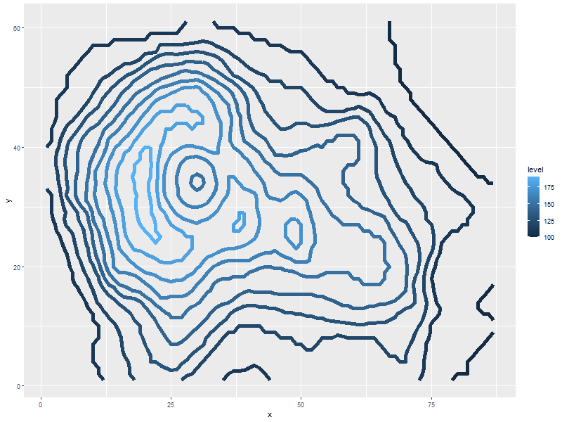
5.1.7. Just contour lines colored determined by contour level
ggplot(data=volcanoDF, aes(x=x, y=y, z=values)) +
  geom_contour(aes(col=..level..), size=2)              ##  Fatten up the line so the color shows up
5.2. Histograms
5.2.1. Rectangular or hexagon bins
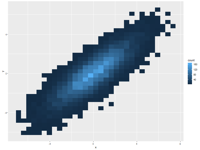
ggplot(data=twoDimNormal, aes(x=x,y=y)) +
  #geom_rug() +                           ## Add a rug (dot-plot) to each axis for lower density plots
  stat_bin2d(aes(fill=..count..))         ## Use this for rectangular bins!
  #stat_binhex(aes(fill=..count..))       ## Use this for hexagon bins.
5.2.2. Density Estimation via scatterplot with semi-transparent data points
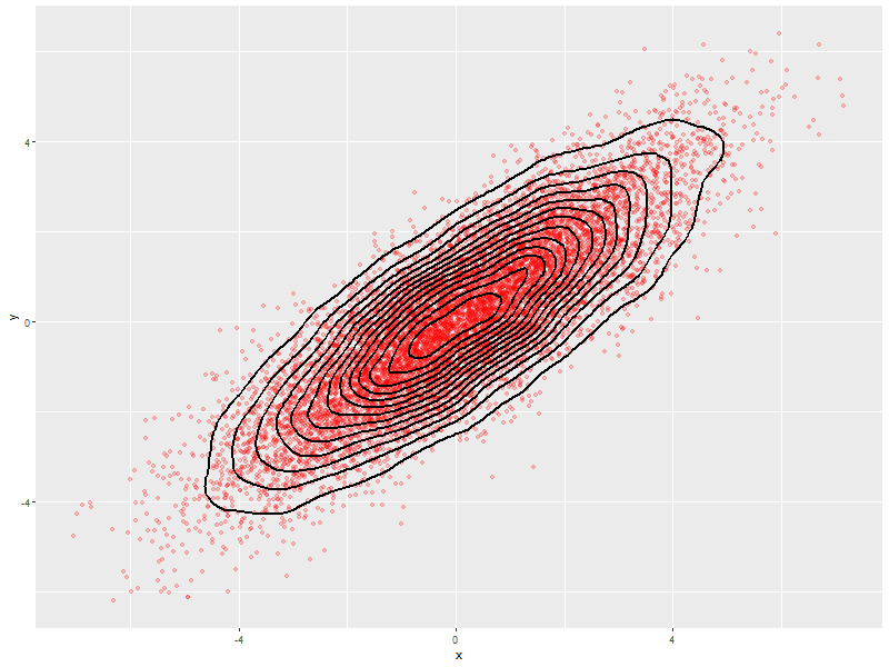
ggplot(data=twoDimNormal, aes(x=x,y=y)) +
  geom_point(alpha=.2, col='red') +           ## Alpha to visually indicate density
  #geom_rug() +                               ## Add a rug (dot-plot) to each axis for lower density plots
  geom_density2d(col='black', size=1)         ## Put contour lines after points to make sure we can see them.
5.2.3. Density Estimation via a filled contour graph
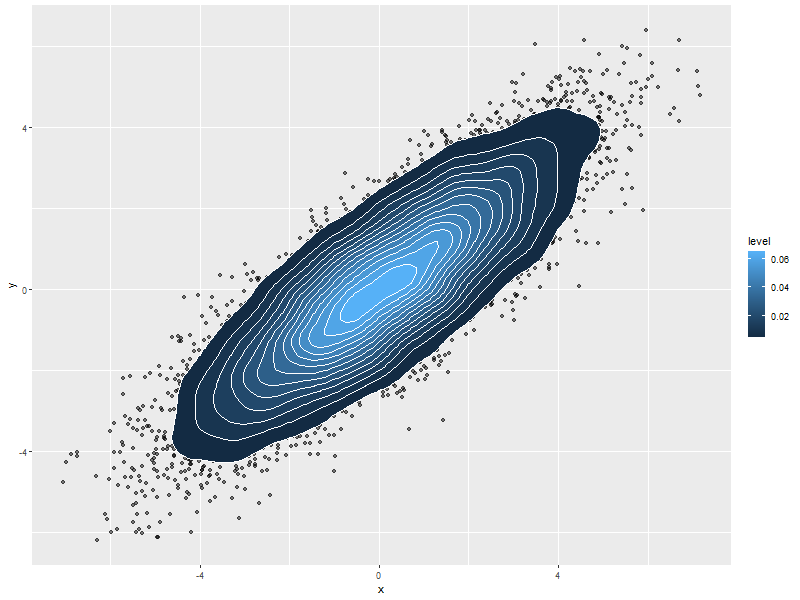
ggplot(data=twoDimNormal, aes(x=x,y=y)) +
  geom_point(alpha=.5, col='black') +         ## Show outlier with dots (must be first)
  #geom_rug() +                               ## Add a rug (dot-plot) to each axis for lower density plots
  stat_density2d(aes(fill = ..level..),       ## Fill in the contour graph -- covering up non-outlier points.
                 geom="polygon", col='white')
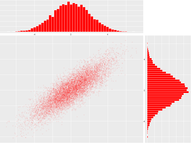
5.2.4. Scatter plot with marginal histograms
histTop <- ggplot(twoDimNormal) +                                     ## Create histogram that goes at the top
  geom_histogram(aes(x=x),
                 col='white',
                 fill='red',
                 binwidth=diff(range(twoDimNormal$x))/50) +
  theme(axis.ticks = element_blank(),
        axis.text.x = element_text(margin=margin(0,0,0,0,"pt")),
        plot.margin = unit(c(0,0,0,0),"lines"),
        axis.title.x = element_blank(),
        axis.text.y = element_blank(),
        axis.title.y = element_blank(),
        axis.ticks.length = unit(0,"null")) +
  scale_x_continuous(limits=range(twoDimNormal$x))

histRight <- ggplot(twoDimNormal) +                                   ## Create histogram that goes at the right
  geom_histogram(aes(x=y),
                 col='white',
                 fill='red',
                 binwidth=diff(range(twoDimNormal$y))/50) +
  coord_flip() +
  theme(axis.text.x = element_blank(),
        axis.text.y = element_text(margin=margin(0,0,0,0,"pt")),
        axis.ticks = element_blank(),
        plot.margin = unit(c(0,0,0,0),"lines"),
        axis.title.x = element_blank(),
        axis.title.y = element_blank(),
        axis.ticks.length = unit(0,"null")) +
  scale_x_continuous(limits=range(twoDimNormal$y))

maxCount = max(c(max(ggplot_build(histTop)$data[[1]]$count),          ## Set idential scales for histograms
                 max(ggplot_build(histRight)$data[[1]]$count)))
histTop   <- histTop + scale_y_continuous(limits=c(0,maxCount+1))
histRight <- histRight + scale_y_continuous(limits=c(0,maxCount+1))

scatter <- ggplot(twoDimNormal)+                                      ## Create scatter plot in the center.
  geom_point(aes(x=x,y=y), col=rgb(1,0,0,.05)) +
  theme(axis.text.x = element_blank(),
        axis.ticks = element_blank(),
        plot.margin = unit(c(0,0,0,0),"lines"),
        axis.title.x = element_blank(),
        axis.text.y = element_blank(),
        axis.title.y = element_blank(),
        axis.ticks.length = unit(0,"null")) +
  scale_x_continuous(limits=range(twoDimNormal$x)) +
  scale_y_continuous(limits=range(twoDimNormal$y))

aGrob <- arrangeGrob(histTop,                                         ## Put it all together
                     grob(),
                     scatter,
                     histRight,
                     ncol=2,
                     nrow=2,
                     widths=c(3, 1),
                     heights=c(1, 3))
grid.newpage()
grid.draw(aGrob)
6. Barcharts
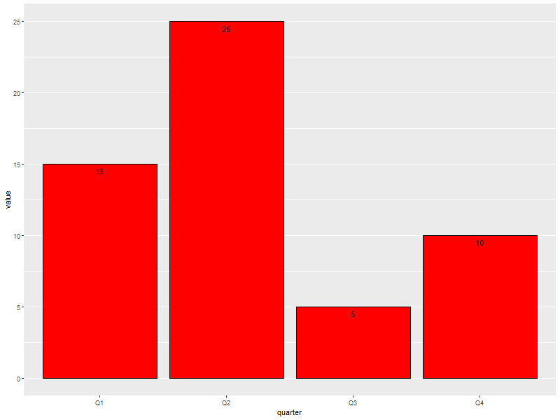
6.1. With pre-computed data
ggplot(data=someLessData, aes(x=quarter, y=value)) +
  geom_bar(stat='identity', col='black', fill='red') +       ## Draws red bars with black borders
  geom_text(aes(label=value), vjust='top', nudge_y=-0.25) +  ## Adds the numerical label to each bar
  theme(panel.grid.minor.x=element_blank(),                  ## Get rid of the vertical grid lines
        panel.grid.major.x=element_blank())
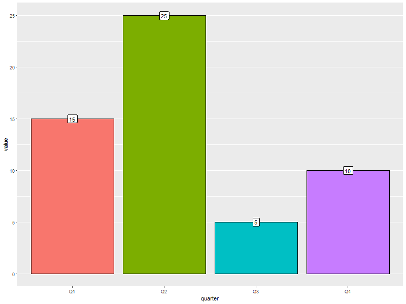
6.2. Barcharts with pre-computed data with color filled bars
ggplot(data=someLessData, aes(x=quarter, y=value, fill=quarter)) +
  geom_bar(stat='identity', col='black', show.legend=FALSE) +        ## col for black lines between bars
  geom_label(aes(label=value), fill='white', vjust='center') +       ## Number on each bar
  theme(panel.grid.minor.x=element_blank(),                          ## Get rid of the vertical grid lines
        panel.grid.major.x=element_blank())
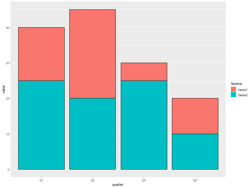
6.3. Stacked barchart
Note: This form of barchart is easily misread by may people. Not generally recommended.
ggplot(data=someMoreData, aes(x=quarter, y=value, fill=factors)) +
  guides(fill=guide_legend(override.aes=list(colour=NA))) +       ## Zap slash across the legend color boxes
  geom_bar(stat='identity', col='black', position="stack") +
  theme(panel.grid.minor.x=element_blank(),                       ## Get rid of the vertical grid lines
        panel.grid.major.x=element_blank())
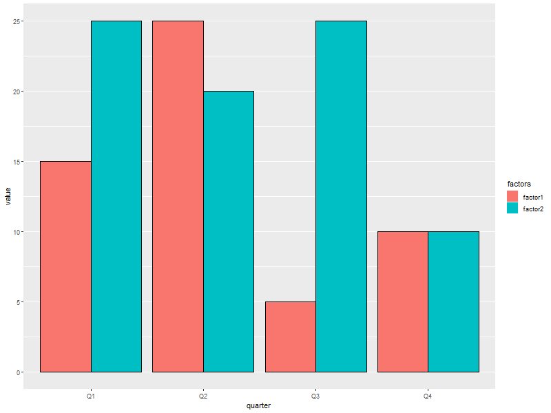
6.4. Side by side barchart
ggplot(data=someMoreData, aes(x=quarter, y=value, fill=factors)) +
  guides(fill=guide_legend(override.aes=list(colour=NA))) +       ## Zap slash across the legend color boxes
  geom_bar(stat='identity', col='black', position="dodge") +
  theme(panel.grid.minor.x=element_blank(),                       ## Get rid of the vertical grid lines
        panel.grid.major.x=element_blank())
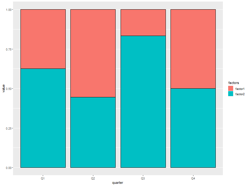
6.5. Stacked with constant height
Note: With more than two colors per bar, this form of barchart is easily misread by may people. Not generally recommended.
ggplot(data=someMoreData, aes(x=quarter, y=value, fill=factors)) +
  guides(fill=guide_legend(override.aes=list(colour=NA))) +       ## Zap slash across the legend color boxes
  geom_bar(stat='identity', col='black', position="fill") +
  theme(panel.grid.minor.x=element_blank(),                       ## Get rid of the vertical grid lines
        panel.grid.major.x=element_blank())
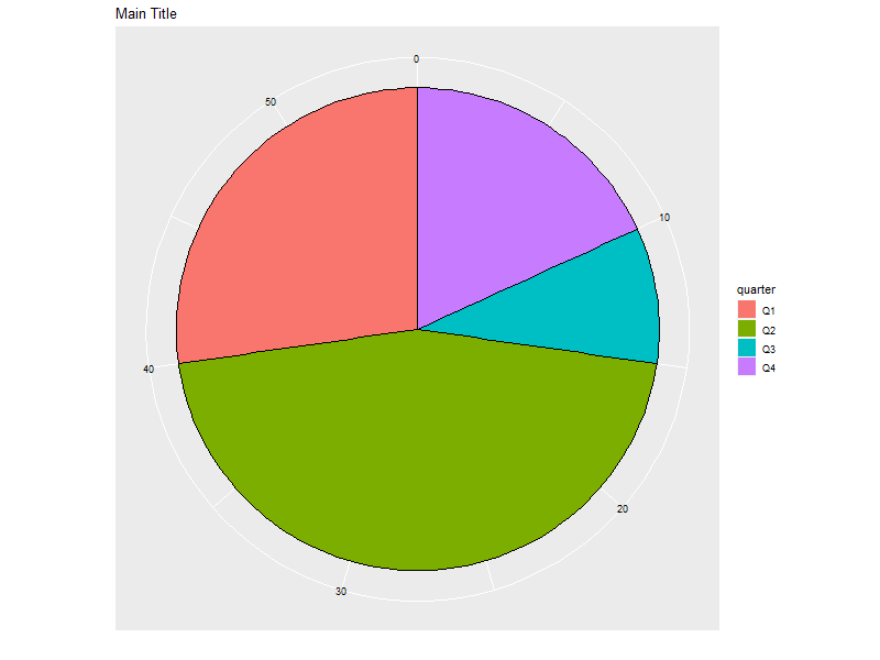
6.6. Circular bar chart
Note: Yhis form of chart is easily misread by may people. Not generally recommended.
ggplot(someLessData, aes(x=factor(1), y=value, fill=quarter)) +
  geom_bar(width=1, stat='identity', col='black') +         ## col puts black lines between slices
  guides(fill=guide_legend(override.aes=list(colour=NA))) + ## Get rid of the slash across the legend color boxes
  coord_polar(theta='y') +                                  ## This is how it gets round
  theme(axis.ticks=element_blank(),                         ## Get rid of axis ticks and labels
        axis.text.y=element_blank(),
        axis.text.x=element_text(colour='black')) +
  labs(title='Main Title',                                  ## You can set the title, but the x & y are ignored
       x='', y='')                                          ## Ignored!
7. 1D Histograms
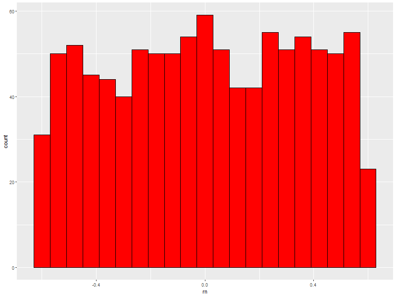
7.1. Basic
ggplot(data=someData, aes(x=rn)) +
  geom_histogram(col = "black", fill = "red", binwidth=diff(range(someData$rn))/20)
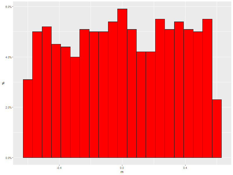
7.2. With percentage instead of count
ggplot(data=someData, aes(x=rn, y = (..count..)/sum(..count..))) +
  geom_histogram(col = "black", fill = "red", binwidth=diff(range(someData$rn))/20) +
  scale_y_continuous(labels=percent) +
  labs(y='%')
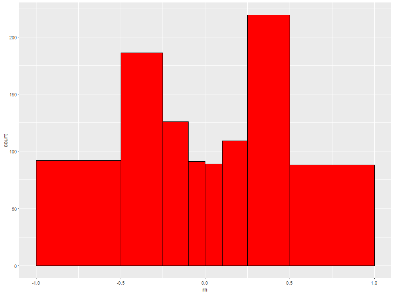
7.3. Hard coded, inconsistantly sized, bin breaks
ggplot(data=someData, aes(x=rn)) +
  geom_histogram(col = "black", fill = "red", breaks=c(-1.0,-0.5,-0.25,-0.1,0.0,0.1,0.25,0.5,1.0))
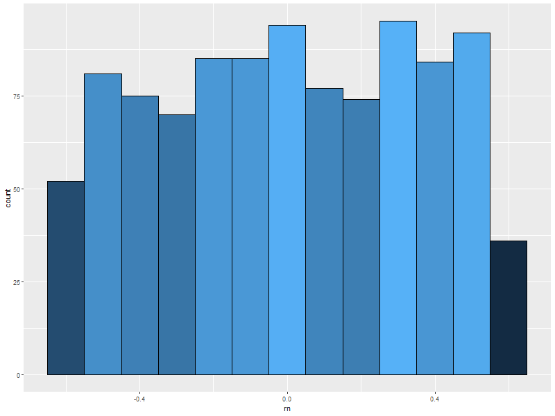
7.4. Fill color determined by bin count
ggplot(data=someData, aes(x=rn, fill=..count..)) +
  geom_histogram(col = "black", binwidth = .1) +   ## 'col' gets us black lines separating bars
  theme(legend.position="none")                    ## legend provides no new information (y-axis shows bar height)
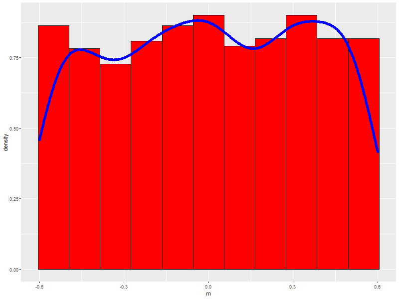
7.5. With a density curve
ggplot(data=someData, aes(x=rn, y=..density..)) +
  geom_histogram(col = "black", fill = "red", binwidth = .11) + ## First so we always see density line.
  geom_density(col = "blue", size=2)                            ## Fatten up line so we can see it
8. Pallets
8.1. Completely custom
For example, a color blind safe palette from http://jfly.iam.u-tokyo.ac.jp/color/
cbPalette <- c("#999999", "#E69F00", "#56B4E9", "#009E73", "#F0E442", "#0072B2", "#D55E00", "#CC79A7")
ggplot(data=someData, aes(x=k1, y=y, fill=k1)) +
  geom_boxplot(col='black', alpha=.4) +
  scale_fill_manual(values=cbPalette)
ggplot(data=someData, aes(x=xd, y=y, col=k1)) + geom_point() +
  scale_colour_manual(values=cbPalette)
8.2. Colorbrewer
8.2.1. Sequential palettes
display.brewer.all(type="div")
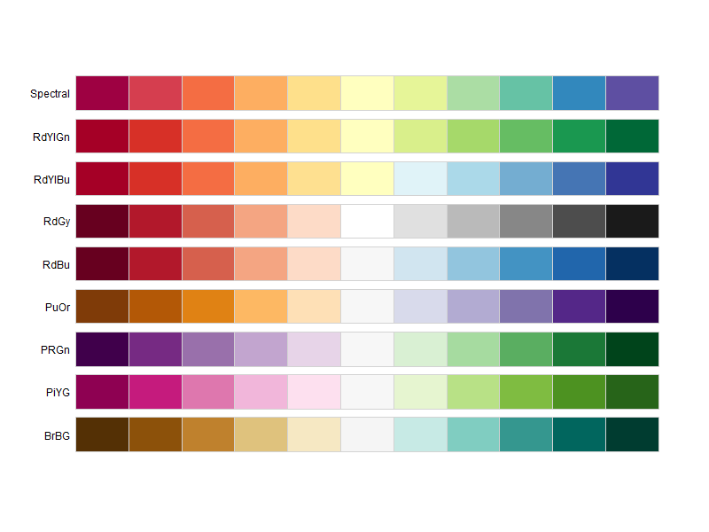
8.2.2. Diverging palettes
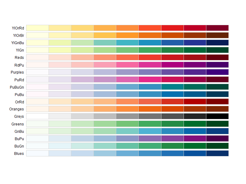
display.brewer.all(type="seq")
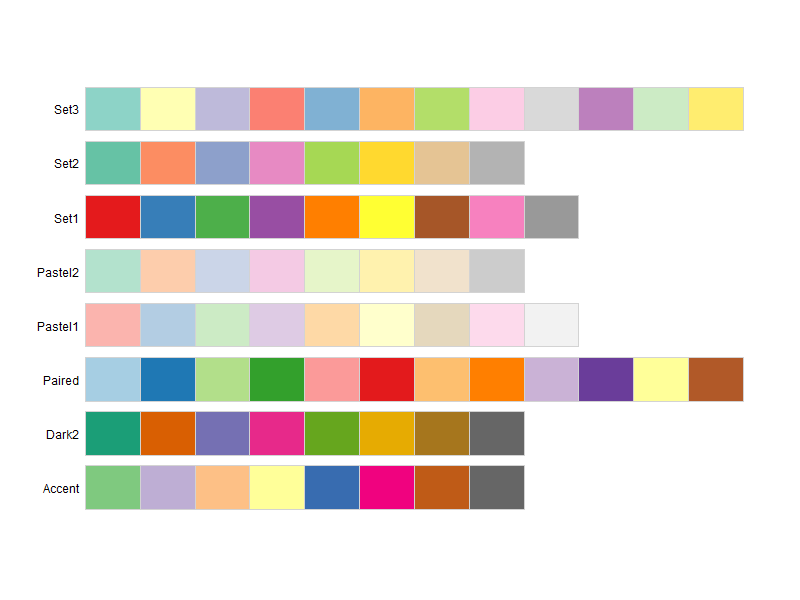
8.2.3. Qualitative palettes
display.brewer.all(type="qual")
8.2.4. With ggplot2
ggplot(data=someData, aes(x=k1, y=y, fill=k1)) +
  geom_boxplot(col='black', alpha=.4) +
  scale_fill_brewer(palette="Set2")
ggplot(data=someData, aes(x=xd, y=y, col=k1)) +
  geom_point() +
  scale_colour_brewer(palette="Set1")
9. Miscellaneous Stuff
9.1. Working without data.frame
9.1.1. Sequence Plot of ONE Vector
Note: Like plot(x)
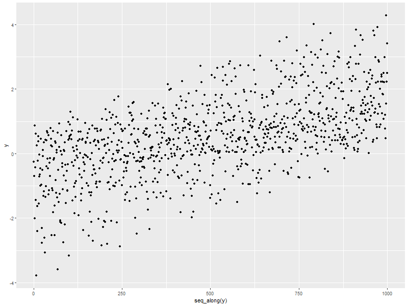
ggplot(data=someData, aes(y=y, x=seq_along(y))) + geom_point()
9.1.2. Scatterplot with a two vectors
Note: Like plot(x, y)
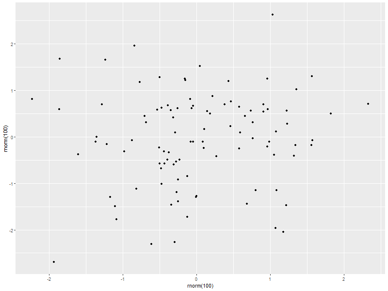
ggplot() + geom_point(aes(x=rnorm(100), y=rnorm(100)))
9.2. Annotate within the plot region
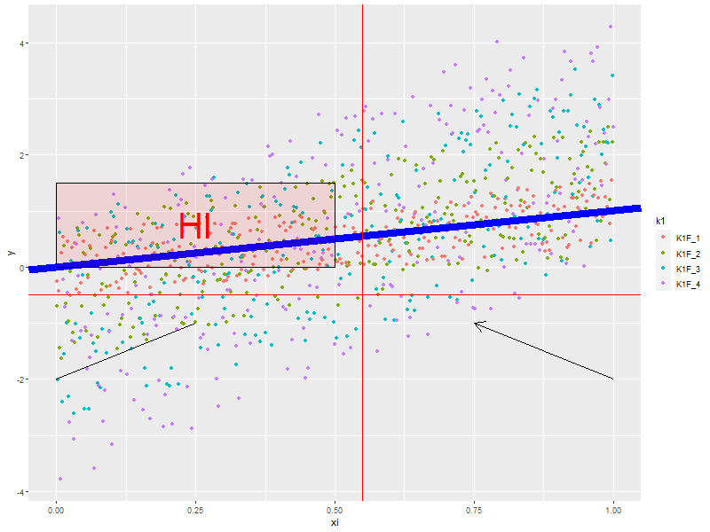
qplot(data=someData,x=xi, y=y, color=k1) +
  geom_abline(intercept=0, slope=1, col='blue', size=3) +                                      ## line
  geom_hline(yintercept=-.5, col='red') +                                                      ## horizontal line
  geom_vline(xintercept=.55, col='red') +                                                      ## vertical line
  annotate("text", x=.25, y=.75, label="HI", col='red', size=14) +                             ## Text
  annotate("rect", xmin=0, xmax=.5, ymin=0, ymax=1.5, alpha=.1, fill='red', col='black') +     ## Rectangles
  annotate("segment", x=0.0, xend=0.25, y=-2.0, yend=-1.0) +                                   ## Segments
  annotate("segment", x=1.0, xend=0.75, y=-2.0, yend=-1.0, arrow=arrow(length=unit(0.5,"cm"))) ## Arrows!
9.3. Combine Graphs
9.3.1. From potentially from different data frames on the same set of axes
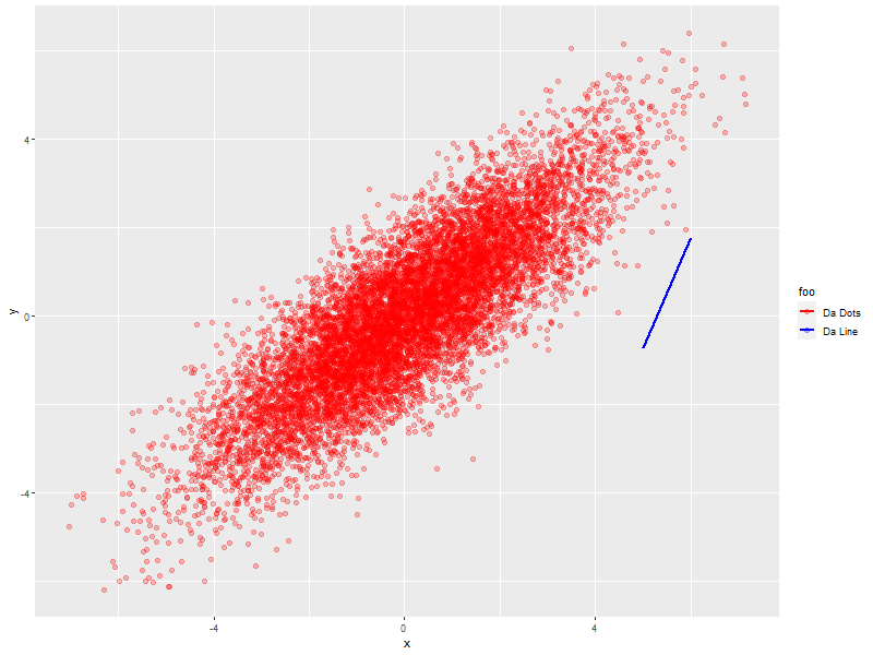
ggplot() +
  geom_point(data=twoDimNormal, aes(x=x,  y=y, col='dots'),    size=2, alpha=0.25) +
  geom_line(data=someData,     aes(x=xi2+3, y=y2, col='line'), size=1, alpha=1.0) +
  scale_colour_manual(name='foo',
                      values=c('dots'='red',     'line'='blue'),
                      labels=c('line'='Da Line', 'dots'='Da Dots'))
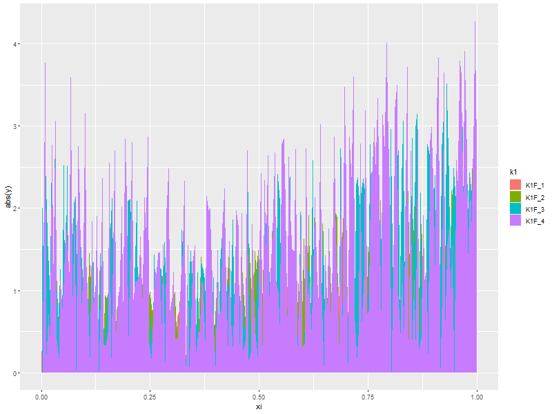
10. Area graphs
10.1. Standard
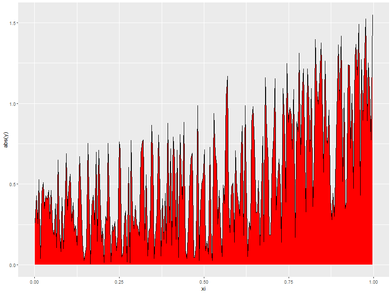
ggplot(data=subset(someData, k1=='K1F_1'), aes(x=xi, y=abs(y))) +
  geom_area(col = "black", fill='red')
10.2. Stacked
Note: Yhis form of chart is easily misread by may people. Not generally recommended.
ggplot(data=someData, aes(x=xi, y=abs(y), fill=k1)) +
  geom_area(stat='identity', position="stack")