Time Series Examples
| Author: | Mitch Richling |
| Updated: | 2022-06-04 16:17:47 |
Copyright 2020-2021 Mitch Richling. All rights reserved.
Table of Contents
1. Metadata
The home for this HTML file is: https://richmit.github.io/ex-R/timeSeries.html
Files related to this document may be found on github: https://github.com/richmit/ex-R
Directory contents:
src |
- | The org-mode file that generated this HTML document |
docs |
- | This html document |
data |
- | Data files |
tangled |
- | Tangled R code from this document |
2. First Steps
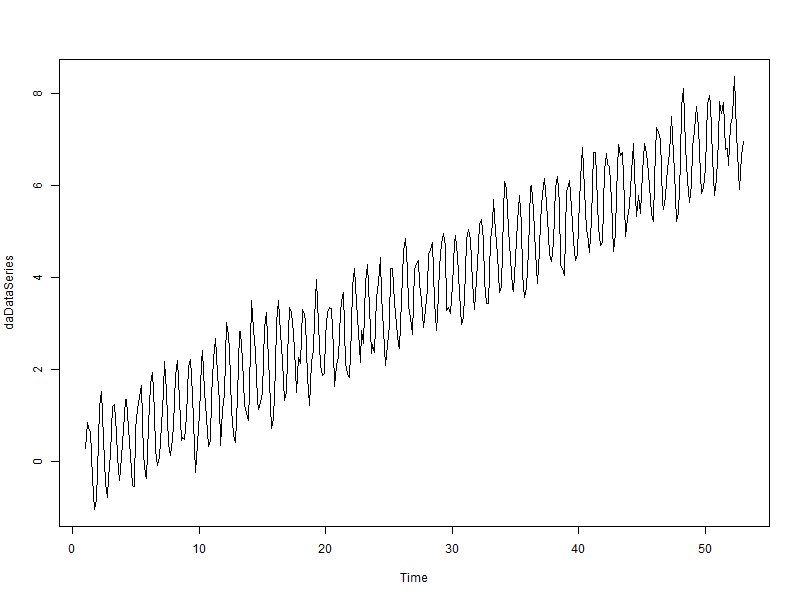
2.1. First we create some data
daData          <- data.frame(date=as.POSIXct('2012-01-01')+(1:365)*(60*60*24))
daData$idate    <- as.numeric(daData$date)
daData$x        <- (daData$idate-min(daData$idate))/(60*60*24)
daData$trend    <- daData$x/50
daData$seasonal <- sin(pi*daData$x/3.5)            ######## TRY THIS: equal positive and negative components
#daData$seasonal <- abs(1+sin(pi*daData$x/3.5))    ######## TRY THIS: positive seasonal component
daData$random   <- rnorm(daData$x, sd=.25)
daData$val      <- daData$trend+daData$seasonal+daData$random
2.2. Construct time series object
We use a frequency of 7 days
daDataSeries <- ts(daData$val, frequency=7)
2.3. Plot our time series
plot(daDataSeries)
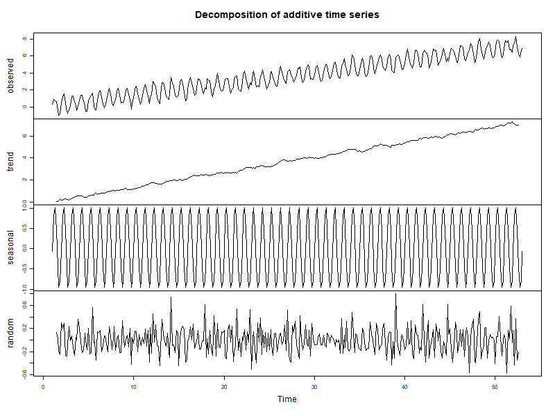
3. Decomposition
3.1. Decompose into an additive seasonal model
daDataDecomp <- decompose(daDataSeries, type='add')
3.2. Plot our decomposition
3.2.1. With base
plot(daDataDecomp)
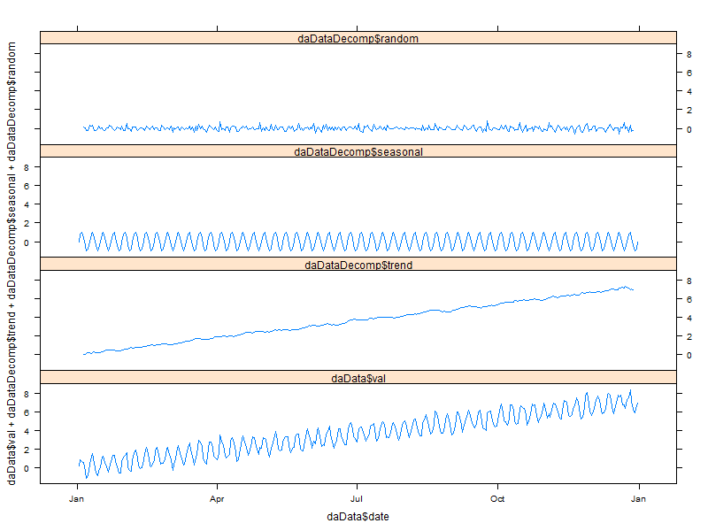
3.2.2. With lattice
xyplot(daData$val + daDataDecomp$trend + daDataDecomp$seasonal + daDataDecomp$random ~ daData$date,
       type='l',
       outer=TRUE,
       horizontal=FALSE,
       layout=c(1,4))
3.2.3. With ggplot2
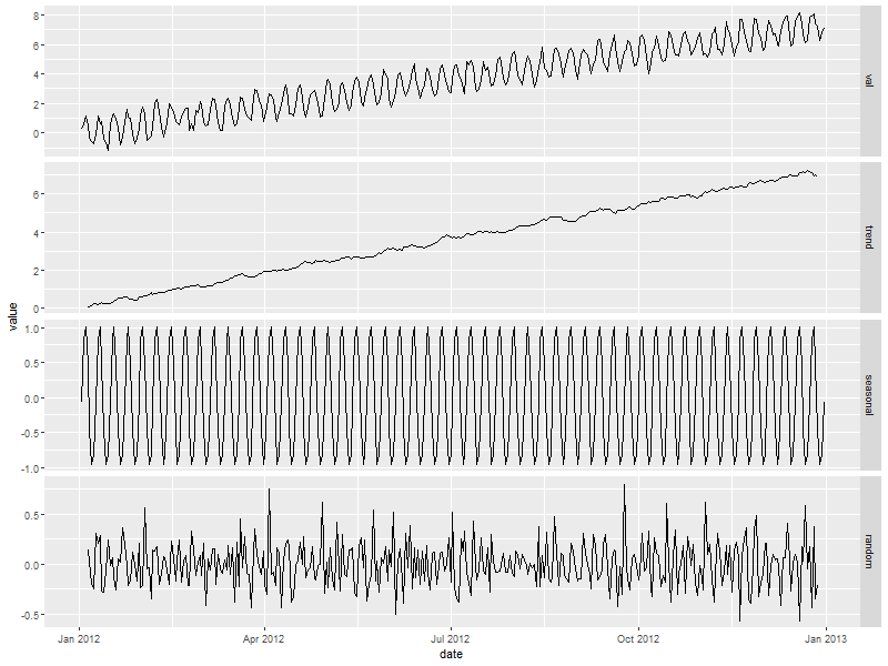
daDataDecompDF <- data.table(date=daData$date,
                             val=daData$val,
                             trend=daDataDecomp$trend,
                             seasonal=daDataDecomp$seasonal,
                             random=daDataDecomp$random)
daDataDecompDF <- melt(daDataDecompDF, id="date")

ggplot(data=daDataDecompDF, aes(x=date)) +
    geom_line(aes(y=value))  +
    facet_grid(variable ~ ., scales = "free")
3.2.4. The KRAZY way
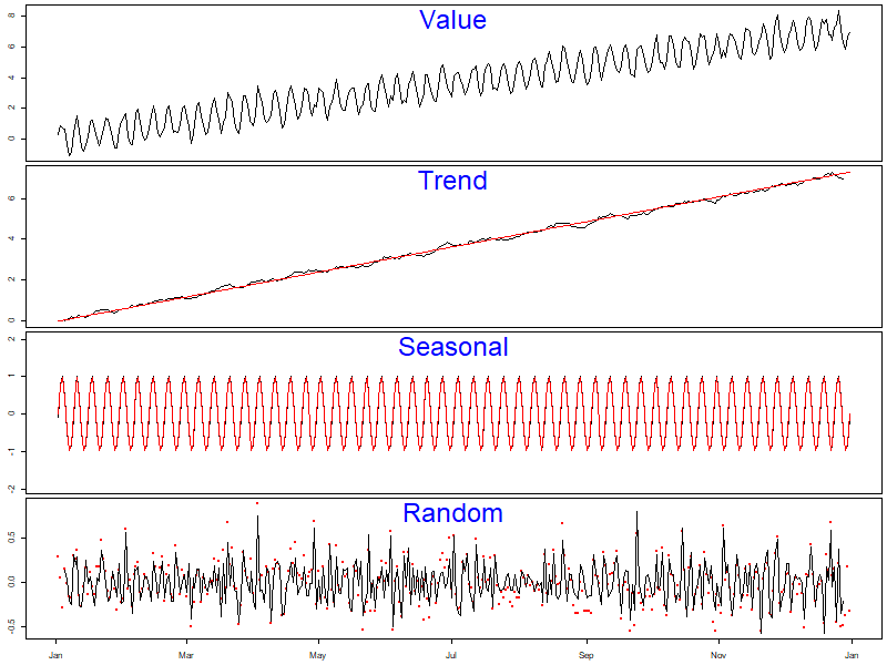
par(mfcol=c(4,1))
par(mar=c(.5,2.5,.5,.5))
plot(daData$date, daData$val, type='l', ylab='', xaxt='n')
text(mean(par('usr')[1:2]), par('usr')[4], 'Value', pos=1, cex=3, col='blue')
par(mar=c(.5,2.5,0,.5))
plot(as.POSIXct('2012-01-01'), 0,
     xlim=range(daData$date), ylim=range(c(daDataDecomp$trend, daData$trend), na.rm=TRUE),
     col=NA, ylab='', xaxt='n')
points(daData$date, daDataDecomp$trend, type='l', xaxt='n')
points(daData$date, daData$trend,       type='l', col='red')
text(mean(par('usr')[1:2]), par('usr')[4], 'Trend', pos=1, cex=3, col='blue')
plot(as.POSIXct('2012-01-01'), 0,
     xlim=range(daData$date), ylim=2*range(c(daDataDecomp$seasonal, daData$seasonal), na.rm=TRUE),
     col=NA, ylab='', xaxt='n')
points(daData$date, daDataDecomp$seasonal, type='l', xaxt='n')
points(daData$date, daData$seasonal,       type='l', col='red')
text(mean(par('usr')[1:2]), par('usr')[4], 'Seasonal', pos=1, cex=3, col='blue')
par(mar=c(2.5,2.5,0,.5))
plot(as.POSIXct('2012-01-01'), 0,
     xlim=range(daData$date), ylim=range(c(daDataDecomp$random, daData$random), na.rm=TRUE),
     col=NA, xlab='', ylab='')
points(daData$date, daData$random,       type='p', col='red', pch=20)
points(daData$date, daDataDecomp$random, type='l', xaxt='n')
text(mean(par('usr')[1:2]), par('usr')[4], 'Random', pos=1, cex=3, col='blue')
4. Fitting
4.1. Fit an arima model
fit <- arima(daDataSeries, order=c(5,0,0), seasonal=list(order=c(2,1,0), period=7))
fit
Call:
arima(x = daDataSeries, order = c(5, 0, 0), seasonal = list(order = c(2, 1,
    0), period = 7))

Coefficients:
         ar1     ar2     ar3     ar4     ar5     sar1     sar2
      0.1770  0.1664  0.1450  0.2400  0.1029  -0.7162  -0.3667
s.e.  0.0527  0.0519  0.0539  0.0525  0.0533   0.0532   0.0523

sigma^2 estimated as 0.09406:  log likelihood = -87.07,  aic = 190.14
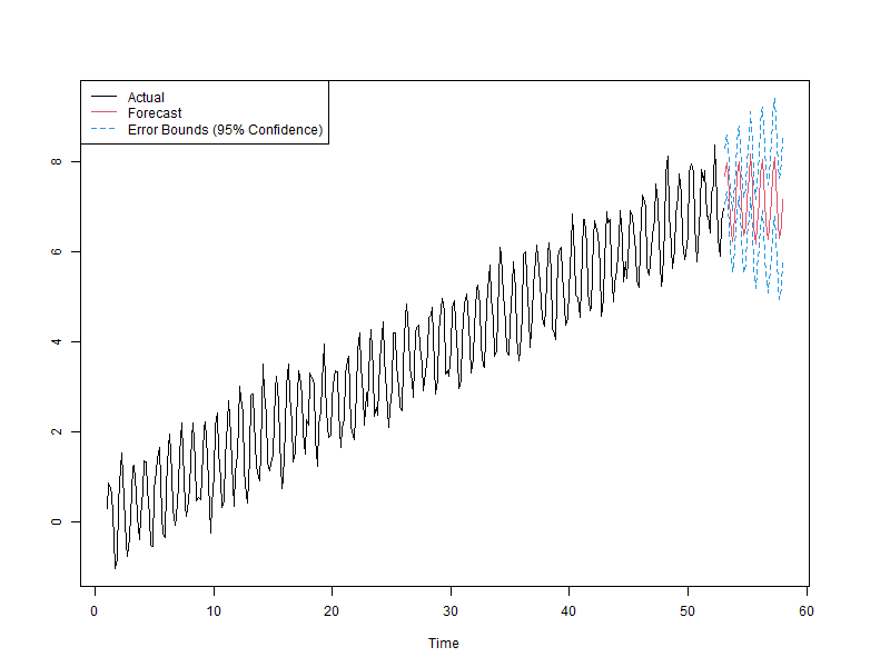
4.2. predict the future
fore <- predict(fit, n.ahead=7*5)
4.3. Compute error bounds at 95% confidence level
U <- fore$pred + 2*fore$se
L <- fore$pred - 2*fore$se
4.4. Plot prediction
par(mfcol=c(1,1))
par(mar=c(5,5,5,5))
ts.plot(daDataSeries, fore$pred, U, L, col=c(1,2,4,4), lty = c(1,1,2,2))
legend("topleft", c("Actual", "Forecast", "Error Bounds (95% Confidence)"), col=c(1,2,4), lty=c(1,1,2))
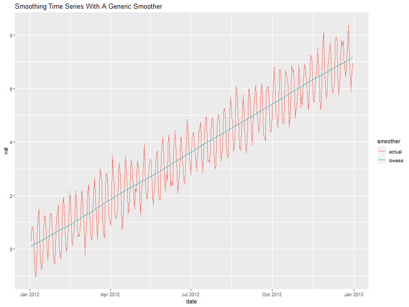
5. Smoothing
6. Use lowess to smooth
smoothedData <- lowess(daData$idate, daData$val, f=.3)
6.1. Put everything in a data.frame for ggplot
Notice that we convert the integers we got from lowess at the same time.
allDat <- bind_rows(mutate(select(daData, date, val),
                           smoother='actual'),
                    mutate(data.frame(date=as.POSIXct(smoothedData$x, origin='1970-01-01 00:00:00 UTC'),
                                      val=smoothedData$y),
                           smoother='lowess'))
6.2. Plot it
ggplot(allDat, aes(x=date, y=val, col=smoother)) +
  geom_line() +
  labs(title='Smoothing Time Series With A Generic Smoother')